I would like to share with you two stories/conversations that took place during the last month.
First Story: It was a few days before Fat Thursday (ελληνικά: Τσικνοπέμπτη) and I was walking alone, when I ran into this familiar Dutch guy.
– Are you in for barbecue and some beers? He asked me
– That sounds great! I replied
– OΚ, let’s meet on Thursday, I ‘ll get the beers.
Second Story: It was a rainy afternoon in the first week of March in Athens (I always wanted to start a narration with such a cliche) when I encountered an old Irish friend.
– What are you doing on St. Patrick’s day? He asked me with his distinct Irish accent
– I don’t know, I’m staying home I guess. No matter how much I miss Ireland, Irish pubs are quite congested on the 17th of March. I got back to him
– I’ll make sure I will pass by. For ould times sake… he said
– I’ll be waiting for you. I told him and with my mind in Galway, I walked away
You must be wondering who are these guys, right? Well they are not real people but simply… brands!
The era when a deep male or a sensual female voice was talking to you about an advertised product is slowly fading away. We see increasingly often examples of “humanized” brands, talking to us directly either on social media or in the two cases aforementioned, on their package. Both “encounters” described above, took place down a supermarket’s aisle.
In Heineken’s case we see the brand talking to you in second singular, with a clear timing (this pack was on sale during early February – just before Fat Thursday) and a clear visual connotation to Fat Thursday (barbecue image on upper half of shrink film). The line the brand is telling to you is festive and constitutes a great example of communicating the multipack promotion in a way that the brand is not devaluated. Clever choice of the company to crop the brand name (it reads only “Heine”) in order to fit it in large font size on the narrow side of the pack and have it printed big enough to read on shelf. Some people are reluctant to crop brand names or logos (I am one of these too) but for such meaningful exceptions, it is ok as the logo still remains recognizable.
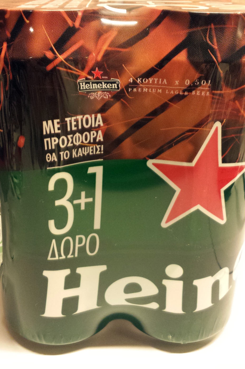
Upper half of the packaging depicts a barbecue – Logo reads “Heine” a cropped version of the brand name to fit in large font size on the narrow side of the pack
In Jameson’s case, the brand is talking to you with clear Irish culture visuals, but omitting traditional/folklore Irish shamrocks and reference to St. Patrick’s Day. In my eyes, the outcome is an iconic limited edition bottle with stand-out appeal, underlining the contemporary personality of Jameson coupled with its Irish heritage. The company is clearly positioning the brand away from category’s norm and the competition (Scotch whiskys). It is a good effort to capitalize on St. Patrick’s day, a great feast that is celebrated very much in other parts of the world and gains momentum in Greece.
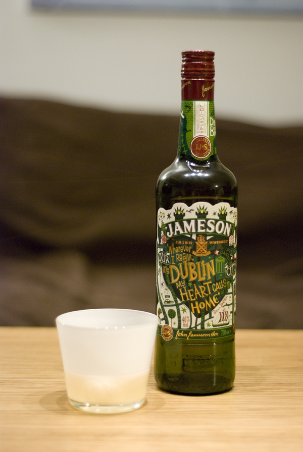
“Wherever I roam, it’s Dublin my heart calls home” is the human messaging on pack
Common points for the two examples, beside the successful “humanization” of the brands, is that they are both into occasion based communication (both of them by launching the packs during the correct timing -early February and early March respectively- but no direct reference to either Fat Thursday or St. Patrick’s day on pack). Talking occasion for a beer or a liquor brand, is very often in the core of brand communication, since most people feel comfortable having either a reason or a good excuse to have a couple of drinks.
With that I would like to leave you with a great song about beloved Ireland and the barley (the common ingredient of beer and whisk(e)y) and wish everyone a Happy St. Patrick’s Day!
