I recently observed the new design for DUO condoms series while waiting in line at a kiosk. I was impressed that the design was so powerful that stood out even in the very cluttered environment of a Greek kiosk.
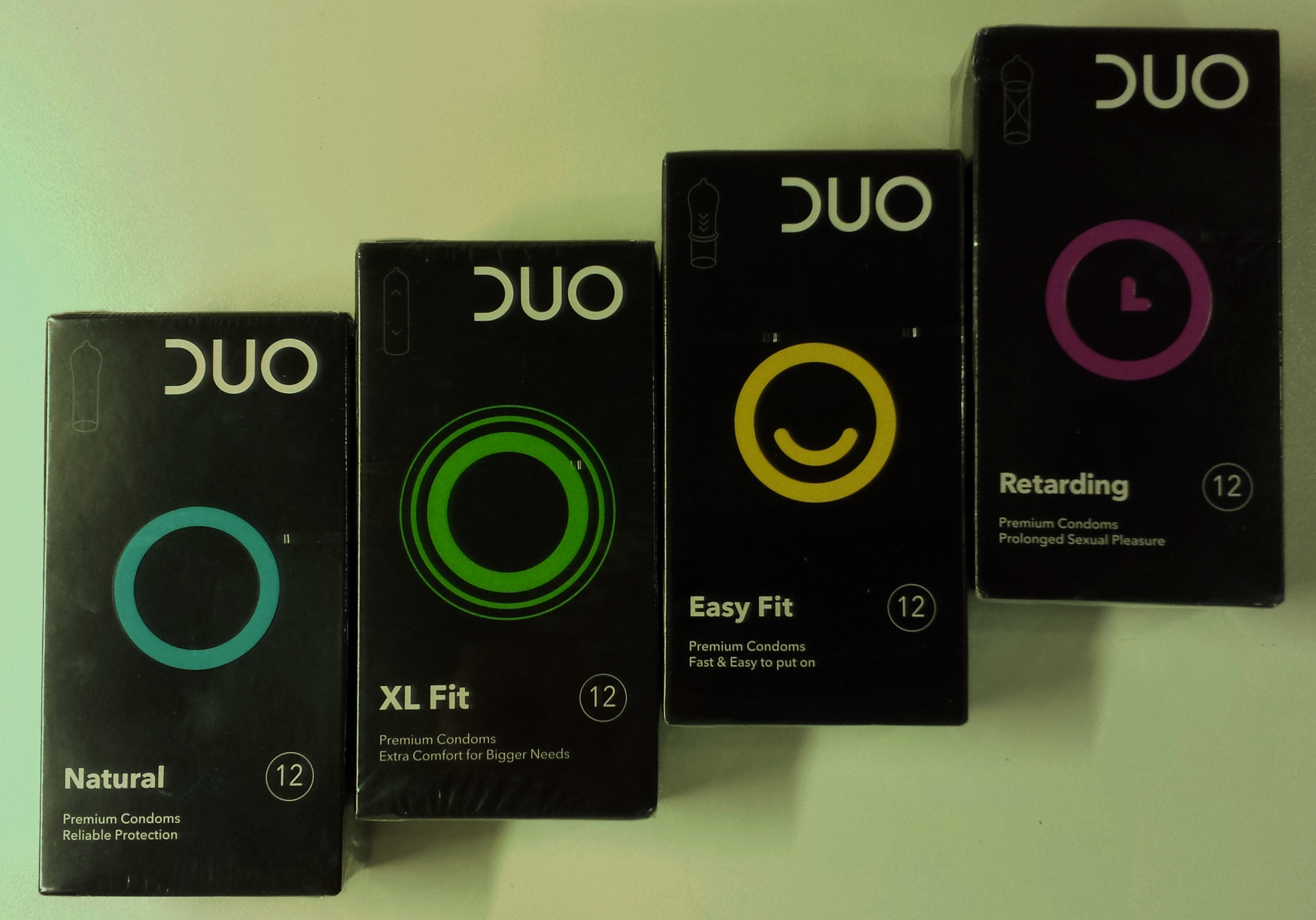
The design appealed to me and I believe it broke the clutter and differentiated from the competition for three bold reasons:
1. The black color. Sexual desire is neither pink nor blue. Most of the times its well hidden within our deeper selves and the only common color I can guess is there is black. Black has a special power in branding as it conveys mystery and premium quality and is relevant to the product proposition.
2. The use of circle in branding. Circle plays a very important role in many arts such as photography for instance (next time try to intentionally include a circular image in your photo and your photographic perception will never be the same). The circle is symmetrical, makes the composition more interesting and it has the property to attract attention. This is the same reason the majority of traffic signs or the shape of traffic lights are circular.
3. The clear design (no small human couple figures, no different color ribbons, etc) that eventually helps the packaging stand out in the shelf. With the different variants of the circle and the use of different colors, both the kiosk owner and the final consumer quickly and without much familiarization time can quickly distinguish each variant. These colored circles keep the information intuitive (thin circle for thin condom, circle with L (later / last) for retarding condom, circle with smiley for easy fit variant etc. Each package winks to the consumer and reveals in a non-verbal way details about the product. What a success for a designer that manages to communicate effectively information in such a non-verbal / universal way.
Have a nice summer, enjoy life and practice safe sex!
