Marketers Strive for More

Those working in marketing are quite familiar with the relentless pursuit of market share, brand awareness, conversion rates, and the list of metrics goes on… Yet, amidst all of these metrics, there are some that are particularly interesting such as the race for claiming association with specific occasions, shapes or even colors.

Let me refer to some familiar examples: Consider the clash of brands competing for association with particular occasions. Kit-Kat claims the “break occasion,” while Coca-Cola stakes its claim on the “meals together occasion.” Then there’s the struggle for dominance in the realm of colors. Mondelez, with its iconic Milka brand, champions the color purple, while Reckitt Benckiser endeavors to be synonymous with pink with their Vanish brand. Lastly there is also the battle for recognition based on shapes. When one thinks of the egg shape, Kinder reigns supreme as the most closely associated brand.

So if you consider the Easter occasion, the imagery of eggs is top of mind… and the egg-shape is traditionally owned by Kinder. What would you do if you were Mondelez, and color purple is your strong asset?

This pursuit of association gave rise to a stroke of genius in packaging.

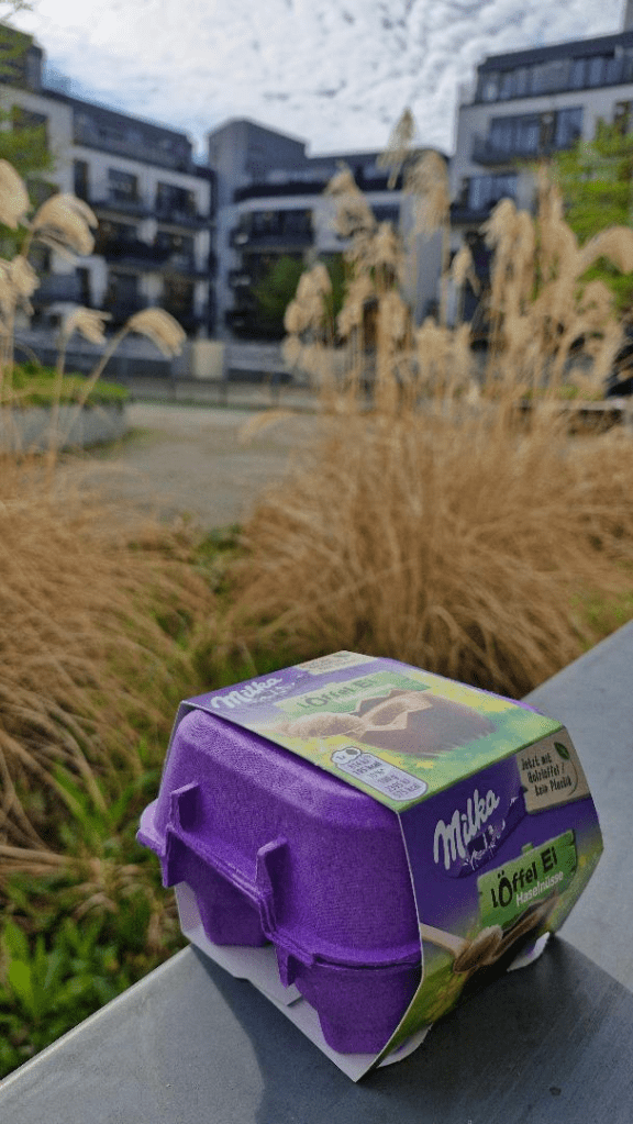
I noticed this ingenious packaging of Mondelez’s chocolate eggs breaking the clutter in shelves, simply by nesting their chocolate eggs in an iconic purple carton (yes the one that real chicken eggs are sold in). In one shot Mondelez asserted ownership over not just the color purple, but also the iconic egg shape and hence the Easter occasion itself. Great move!

Happy Easter to all the witty people out there!
Marketers Strive for More

Everything Communicates

As I was running around my neighborhood, I noticed the below sign in one of the house construction sites along my route. It drew my attention, as it was a clear warning label for keeping safety precautions while on site. One would argue “What’s the great deal about it?” and I may agree to a point until I realized that this communication is checking two very important boxes

  • It serves a great purpose, that is of work safety in a clear, illustrative way
  • It communicates the company group’s name, the company and also a brand motto (which is so cool for a cement company as it translates “relationship on solid foundation”)

Building further on the second point, this leadership practice of placing such signage is ultimately showing respect and professionalism and could be translated multifacetedly as taken by various stakeholders. The constructor (B2B client) is happy with a useful piece of communication material that upgrades his image while keeping him compliant with H&S rules, the potential B2C customer translates this as a responsible practice which may affect positively his preference when buying a B2C product from the company (eg. for DYI use), a business professional may consider the company for employment, a prospect investor may consider purchasing company’s stock (even though Lafarge’s stock has stopped trading in the Athens Stock Exchange for some time)… and the list goes on.

Some may find “Everything Communicates” a cliché, I find this a perennial universal truth.

Everything Communicates

A handmade brand story

What is the role of marketing claims when you are purchasing a product? Why are you buying one product vs. another at the decisive moment in front of the shelf?

Marketing claims are there to generate demand for a certain item (or service if you like). However, most importantly, brands would like to provide you with an emotional benefit (through a brand story) coupled with their product, in order to earn your preference. Handmade products are a special category in this, as they try to tell a unique story that’s also greatly connected to the person who actually made the product.

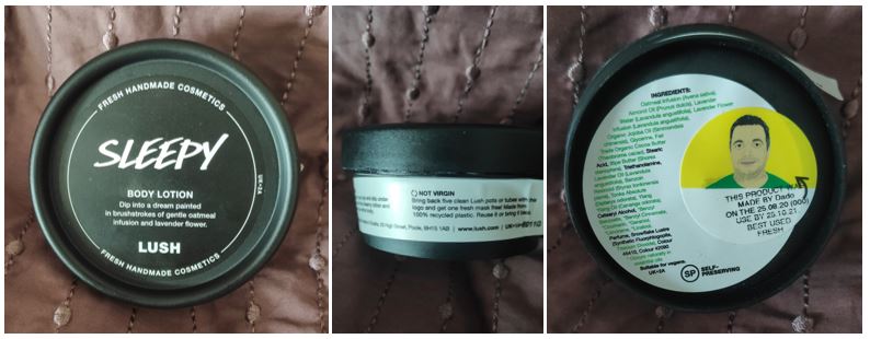
In this frame I particularly liked the below practice from Lush, a cosmetics manufacturer and retailer that make their products using only vegetarian or vegan recipes. I found out that 100% of their products are handmade by people who mix up fresh batches of materials everyday. I got a hold of a Lush product and the package looked quite ordinary at first. Nothing but the claim “handmade” on top of the pack to stress that this product was indeed handmade but… wait a minute… as soon as I flipped the cream container; I noticed a face sticker at the bottom of the package. This is the cartoon version of the person who actually made the product! His name is Dada (!) and his cartoon version looks a bit like me. What a fantastic twist having this kind of visual information on pack. Knowing who made the product and looking at the graphic version of his/her face, gives you a warm feeling and bonds you with the product. This practice conveys a unique story, as soon as this handmade product by a unique individual reaches your hands. In this “uniqueness relay”, the final receiver of the product cannot help but feeling unique and taken care of!

I’m closing with a quote from the company’s website, on why they insist on offering handmade products. This encapsulates their beliefs, constitutes a beautiful brand story and is indeed a very strong element of their USP. “This way, we can ensure that everything we use is of the highest quality and has been ethically sourced from beginning to end. Ever since our humble beginnings, handmade has been a part of our story. It’s not just part of our name; it’s part of who we are.”

Great stuff! What is your brand story that conveys your unique selling proposition?

A handmade brand story

Hit while the iron is hot

Covid19 has a tremendous negative impact on the economy so far. However, as all wise people would argue, every coin has two sides. For financial services corporations like Visa, Covid19 has been a main driving force for even wider adoption of card payments and more specifically contactless payments. It seems that contactless payments are indeed on a sharp rise worldwide, especially during the last months. What should financial services companies offering contactless payments do in such an occasion? Should they lay back and enjoy the favorable side effect of a pandemic or ride the wave and try to establish both contactless payments as well as themselves as leaders in this field.

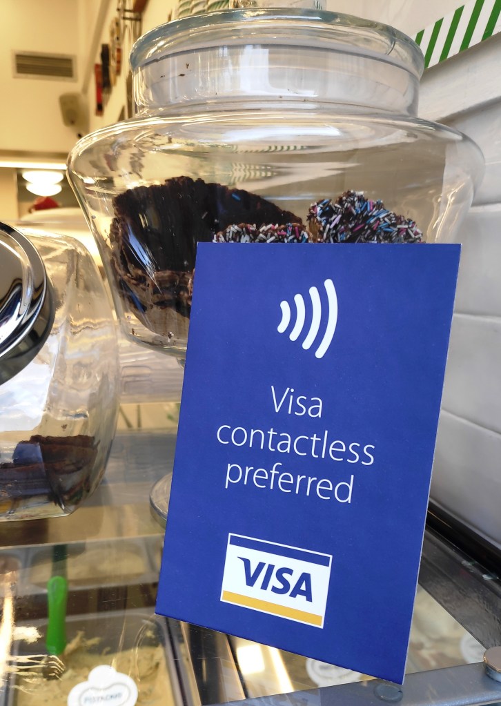
Visa decided to do the latter, and hit while the iron is hot. I noticed the below table tent in a gelateria in the center of Athens. I particularly enjoyed the straightforward messaging (Visa contactless preferred) as it was the shortest message possible, with the brand mentioned first and the word “preferred” serving as a nudge rather than an obligation or an option. The artwork was uncluttered and the placement of the table tent on top of the ice-cream vitrine could not be better. I paid using my contactless Visa.

Well played Visa, well played.

Visa Point of Purchase advertising material

Hit while the iron is hot

On Naming Your (Soap) Product

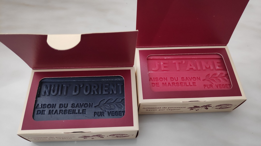
Nowadays, following the outbreak of the Covid-19 virus, we wash our hands several times a day. Since I was looking for a milder alternative for washing my hands, I drew some Marseilles soap bars from the cupboard, which I had purchased from France some time ago.

Marseilles_Soap_Bars

While smelling their scent for picking one of them, I noticed that the names were not descriptive but rather conceptual: Je t’aime, Masculine, Nuit d’Orient.

Amidst negative news on the virus, even while just reading the soap names, I experienced for an instance a warm feeling. I believe it is a great idea, to tie your product name with the feeling you want people to have when using it. Product names should indeed create positive associations and evoke an emotion. Naming your product in the right way, can build a story that affects how customers perceive the value of it.

Stay home, stay safe, stay calm and wash your hands.

On Naming Your (Soap) Product